Project background
After the successful testing and socialization of the previously detailed mobile app, the Home Lending Group asked our team to create a VR experience for first-time home buyers.
We decided to gamify the project after some initial research because we wanted the users to feel as if they were accomplishing a goal by interacting with it; we wanted to give them a reason to play.
My approach
The Home Lending Group was interested in exploring VR as an educational channel, but did not have the in-house resources to be able to devote to learning about, designing, and building a new project in an unfamiliar medium.
The Innovation Group has a small, dedicated VR development team that is able to handle short-term engagements but this was their biggest total ask yet. While able to build an environment, the Home Lending Group’s request would require UI, interaction scripting, and storytelling that our VR design team is not equipped to create by themselves. My design team was asked to produce these more nuanced aspects of the project so that the development team could focus on building the best environment that they were able to. Excited by the prospect of working in a new space, I volunteered to lead the design.
I chose to go with a game so that the user would want to do well. Here’s my thought process: the real home-buying process has serious consequences, both positive and negative, and the target audience of first-time home buyers should be given a glimpse into this. Creating actual stakes and the potential to “lose” is a novel idea to the bank, but would be familiar to anyone in the target audience who is familiar with the general structure of video games. It was an admittedly hard sell to my management, but the results spoke for themselves in the end.
We had a tight deadline for this: Sibos 2018, a huge banking conference where large banks from around the world will showcase their latest innovations. The final product was shown as part of Wells Fargo’s keynote, and later demonstrated in smaller, breakout sessions throughout the conference. Wells Fargo’s top leadership has decided that this project will be a key demo whenever we have potential partners visiting the Innovation Group’s space to exhibit our capabilities.
Early Ideation
This is, admittedly, my first project in the VR space so I wanted to do as much due diligence as possible before design sprints began.
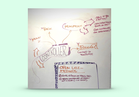
Sketches of potential controller design schema
I led many ideation sessions with developers, product managers, and other designers to generate as many ideas as possible. The content strategist and I decided upon creating a six-chapter game. Due to the tight schedule, the team wanted to focus on the most interactive chapter: a simulated house tour.
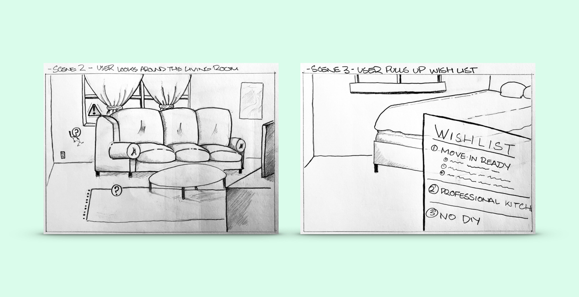
Storyboard sketches of in-game experience
Initial drafts of the menu
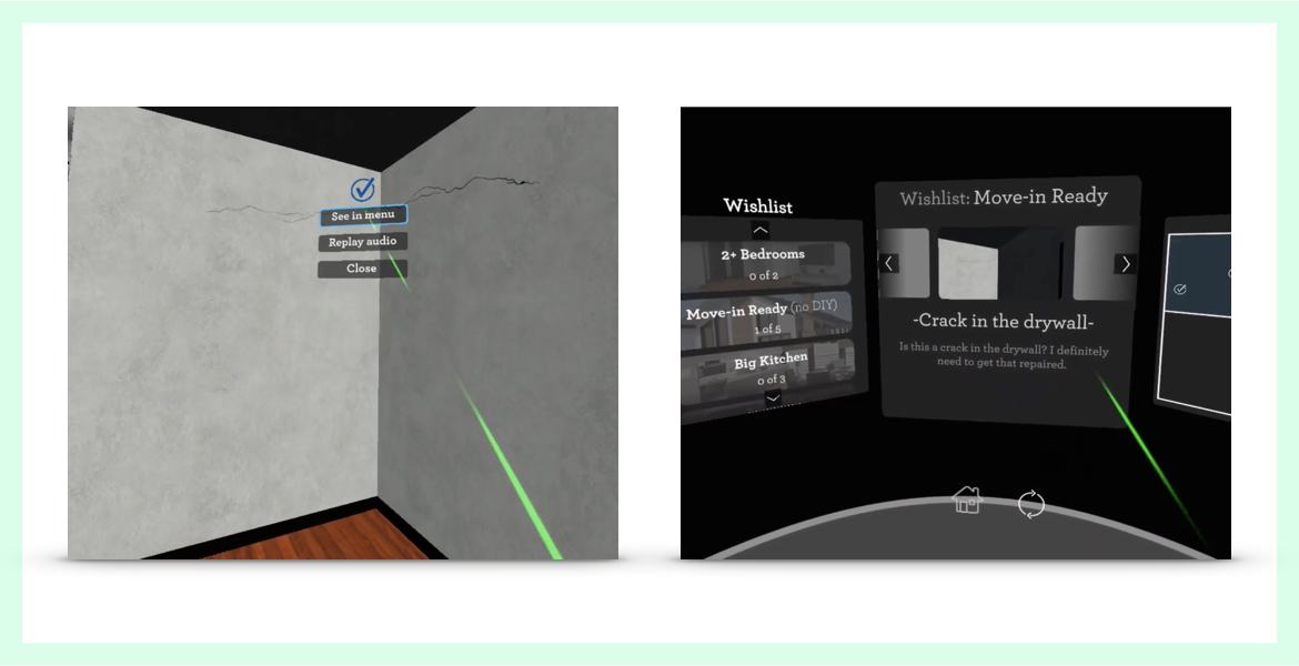
A big piece of the home-tour chapter would be the user interaction with a wishlist of all of their dream home’s wants and needs.
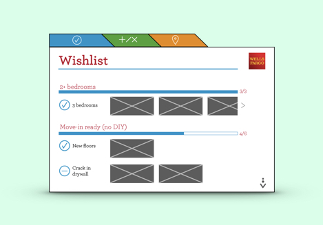
The first iteration of the in-game menu
After building out something that I felt would be fun, accessible, and easy to navigate, I found out that I still had a lot to learn about designing in VR vs. designing for a screen or printed page. The design here was immediately rejected because having white light and small text is unusable in VR.
Research for the menu
At this point, I was feeling a little lost. I had to reexamine many of the “rules” in modern web & app design, and switch up my approach.
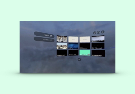
One of the menu design inspiration images
I watched a bunch of Youtube and did screen grabs from VR games that are already on the market. I couldn’t be the first one facing this problem so I needed to figure out what solutions other designers had already created.
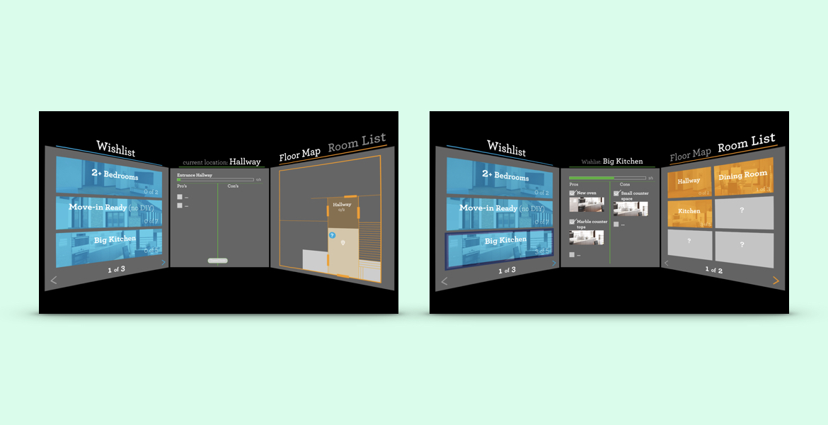
Second draft of the menu
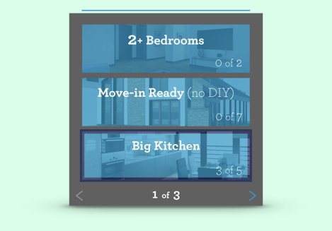
The second iteration of the in-game menu
After a long process of iteration, I created a direction that is usable within VR and allows meaningful user interaction.
After testing this in VR, we found that the colors were far too distracting when viewed as a whole (see it on the next page). However, this was a huge milestone that would heavily influence the final draft.
Second draft menu designs, skewed to resemble in-game experience
Final menu design
The final draft strips out everything but the essentials. It’s unobtrusive, focused on legibility, with a single accent color indicating selection.
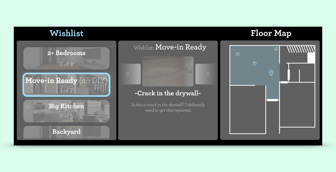
Finalized menu designs
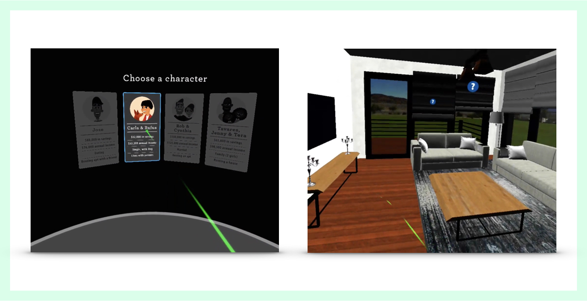
Character selection
After finalizing the menu, creating the introductory selection menu was much more clear. I reused a lot of the same philosophies and assets for each of the sections of this menu.
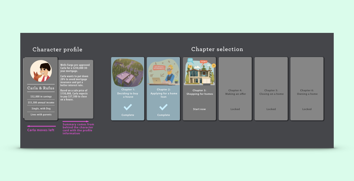
Character and chapter selection UI, with animation notes
Tutorial images
During user testing, we found that people were unfamiliar with VR and therefore had trouble figuring out how to operate the game.
To solve this, I created several versions of a quick how-to image that is used as a loading screen as soon as the game loads.
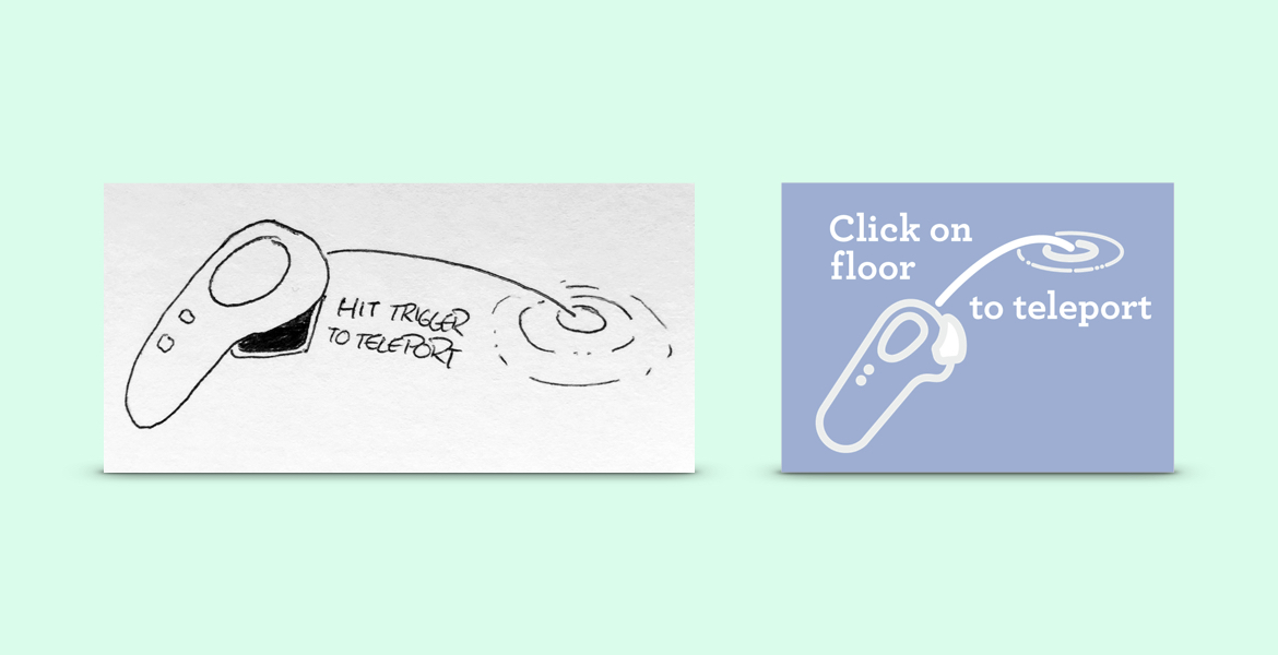
Sketch and resulting in-game image of user tutorial
Gameplay screenshots