Project background
The Home Underwriting Group asked my team to envision a pre-approval and home application that is completely paperless.
The process of buying a home is lengthy, complicated, and requires tons of paperwork. We envisioned an experience that breaks down each step into digestible pieces and reuses as much information as possible, focusing on relieving as much stress as possible.
My approach
The Underwriting Group requested something fresh and unexpected from a large bank. They were seeking to completely revitalize not only their image but also to reassure their customers that Wells Fargo is committed to embracing the ease of user experience that modern customers expect.

App sign-in screen
The main story that I evoked with my overall treatment of their designs was empowerment to the customer. I have personally not been through the home buying process; through research and interviews, I discovered a process that was convoluted from beginning to end. It is bloated, filled with arbitrary documentation and uncertainty. I wanted the user to feel in control so my approach focused on a condensed, step-by-step process that aggregates common information across the entire process. However, I didn’t want to overstep my boundaries and make the user to feel like their hand was being held
The user should feel in control and like the decision-making was up to them
Three distinct versions of a mobile experience, all of which used a question-an-answer chatbot backend, were ideated and tested in focus groups: the Guided, Madlibs, and Chatbot views.
The final deliverables were a POC, used for the purpose of testing some of our theories and new technology. I believe that many of these innovations, such as common applications, account aggregation, and using video as a legal signature, would have been suitable for use by customers outside of this project. However, it was decided that this experience would be a good place to showcase the Innovation Group’s new chatbot conversational UI platform, and so our design team disengaged.
Early ideation
We didn’t know where to start but knew that we wanted to do some immediate mockups to gauge our direction ASAP.
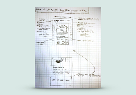
UI mockup illustration
After some research, we settled on creating an initial experience that covers pre-approval through the process of selecting a home. Here is a sketch that was translated into rough mockups in a day’s time.
I drew this sketch, took the photos, and created the designs and research below.

First drafts of pre-approval UI

Early personas and user journeys
Guided view

"Guided" UI screens
The second version focused on process simplification, and gave users set options to select from to move through each screen.
It was later dubbed the “Guided” view because it clearly separated different submissions and gave plain-english descriptions of steps would regularly be buried in legal language.
MadLibs view

"MadLibs" UI screens
The second version focused on process simplification, and gave users set options to select from to move through each screen.
This iteration functions similarly to the “Guided” view, uses selections to populate a fill-in-the-blank UI. The design team called this the “Madlibs” view because of the front-facing sentence structure.
Chatbot view

"Chatbot" UI screens
The last and simplest version is a conversational UI that uses a back-and-forth with a chatbot to fill in the customer’s application.
The chatbot framework has been a major initiative in the Innovation Group. The bots are all built by an in-house A.I. development team. Both of the previous views are powered by the bots but are given a fresh coat of paint, but this is operationally-oriented view.
Video as a signature
We used videos embedded at crucial points along the pre-approval flow to indicate a user's understanding and acceptance.
Instead of reading through legal documentation, a short video would pop up and explain key language and concepts. If the user let the video play out, it would function as a checked box that indicated that they understood and accepted this section.
I wrote, directed, edited, animated, and acted in the video stills here.
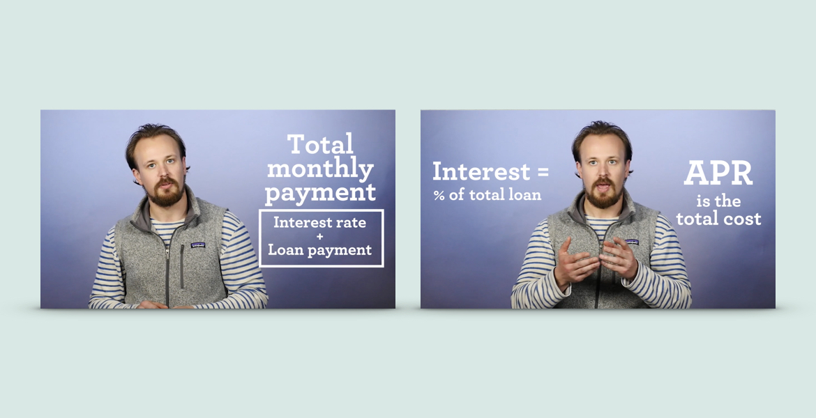
Video stills from the "Video as a signature" POC
Cross-bank access
We integrated the ability for users to add their total account values across several major banks to get an accurate bid and loan amount.

Cross-bank access UI
One of the biggest challenges that we faced was the documentation of a user’s total assets. Wells Fargo can see a user’s account with us, but would have to self-report all of their outside accounts. We wanted to use a bot script to take a snapshot of a user's account totals if they gave us access to do so.