Project background
The Innovation Collaboration Program enables customers and team members to connect anytime, anywhere using their preferred and most efficient mode of communication with any device.
I was asked to update their personal branding for all client and customer facing communications, including their logo, communications slide deck, and their web design.
My approach
The leadership of the Innovation Collaboration Program group needed updated visual branding to match their focus on cutting edge collaboration technology. They felt that using classic design systems within the bank were stale, and didn’t communicate their commitment to bringing team members together by embracing modern video, audio, and recording products.
Unlike the AI project detailed prior, the Collaboration group wanted to stay closely aligned with the Wells Fargo brand while still maintaining a revitalized look and feel. This incurred an interesting design challenge: striking a balance between an established, 150 year old brand while still embracing modern paradigms of user experience and visual design.
They want something classic, that doesn't mean it has to be boring
The main story that I evoked with my overall treatment of their designs was one of established trustworthiness within the existing structures and ideals of the bank. Smaller, more agile companies can make quick pivots in their products and workflows while Wells Fargo is a 275,000+ employee behemoth, and it can take a lot to shift direction. The Collaboration group’s main goal isn’t to shake up that environment but rather to address some of its existing communication issues using the same technologies that many implicitly forward-thinking companies have already embraced. Their designs indicate that they are a part of the ecosystem but are always looking outward for inspiration.
The classic red gradient with white overlay of their logo and slides are meant to signal their belonging and loyalty to Wells Fargo’s legacy. Tans and dark grays are meant to be a soothing contrast for the user, grounding their unique visual styling in accessibility and unobtrusiveness. I added splashes of unexpected dark shades of color and the most modern typefaces in our brand guidelines to create visual intrigue, clarifying the Collaboration group’s commitment to expanding the bank’s horizons.
Early Drafts
When I thought of collaboration and the group’s mission, my first thought was around using technology to seamlessly fit into their users’ lives.

First drafts of logo mark
I also went with with a color scheme that I thought generally reflected a tech-savvy approach to work.
Both the color scheme and original puzzle piece idea were deemed too far outside of Wells Fargo. I went with a more general, tested style that aligns better with Wells Fargo’s branding.
Group Deck
I tried to go with something that would both be instantly accepted by a wide audience but still retain an air of sleekness and style. Overall, I tried to push the group towards a general feeling of calm, professional composure, so my new designs:
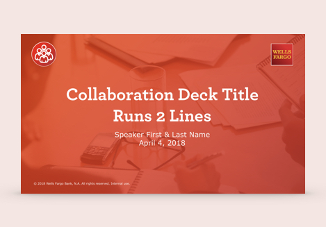
Title slide
- Used a humanistic approach. There are a lot of photos used in the deck where the information presented doesn’t necessitate the use of the entire canvas.
- Spread information out in order to declutter once-complex ideas. Where there was a lot of text, I wanted it focused and accessible.
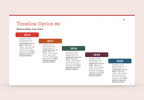
Timeline slide
- Use unexpected layouts to display classic, necessary processes. Graphs and timelines are always needed, but I wanted to give them a more modern appeal through color and dynamic balance on-screen.
Website Redesign
Their website needed some serious help. Built using an internal web portal that hadn’t seen an update since 2006, it looked ancient. Simply put, their site did not reflect the innovation-focused work that their team was doing.
Since I was not allowed to build outside of the portal, my solution was to use it’s own rules against it. I constructed several building blocks in Adobe Illustrator, exported, and then stacked them on top of one another and side-by-side in a table so that each could function as a separate outside link as needed. Using this method, I identified several common patterns in contemporary web design that could make the most out of the given space:
Final draft of completed website redesign (stitched)
- Using a single-page layout would mean that users didn’t have to click out of the page to find any of the information that they came for.
- Cleanliness and clear separation between the groups of information were obtainable using color and structure. I could completely control the layout of the images, as opposed to having to work within defaults of the portal.
- Using a standard 12-grid system, the content could be easily and seamlessly aligned.
Logo
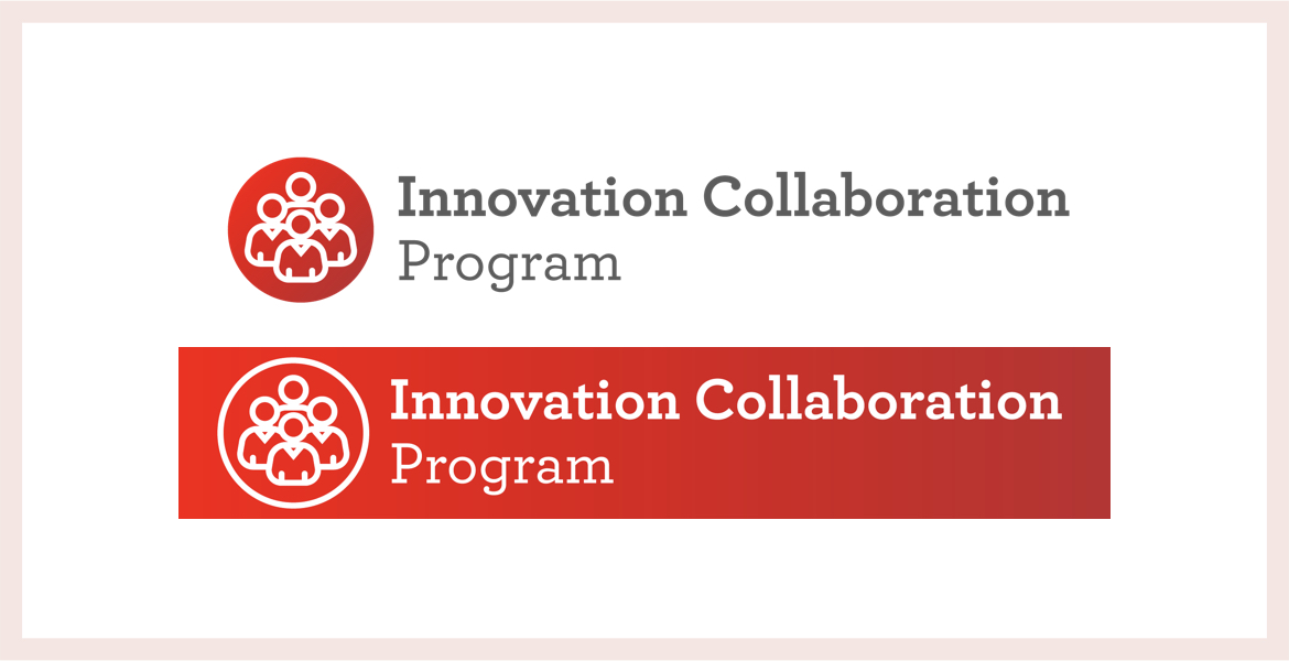
The Collaboration group’s logo is meant to immediately place them inside the purview of Wells Fargo’s trusted brand and emphasize the aspects of togetherness and teamwork present in their projects.
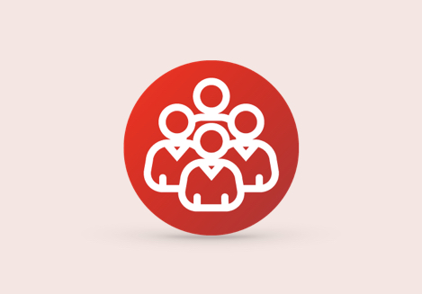
Group logo mark
- Iconography: The central imagery is a general and neutral group of people, meant to communicate the Collaboration group’s focus on the user rather than the technology. Their work brings people together in whatever method works best, with the users and not technology at the center of their projects and decision-making.
- Bold Lines: The logo will often show up at a small size in both printed and electronic communications, so it needed to be read and recognized at all sizes.
- Color Scheme: The group’s logo uses the classic Wells Fargo red gradient in order to align themselves squarely with the bank. However, I decided to use a white overlay in lieu of Wells Fargo’s yellow as I felt that yellow was would jump out too much at the viewer in combination of the other colors in the decided-upon scheme.